The New York Subway System. Holy Crap.
I was recently in New York to visit a friend. Flew into La Guardia and called him up to tell him I was taking public transportation into Manhattan. He sounded puzzled but I didn’t really feel like spending $60.00 getting to West Village. Plus, there’s something to be said for pulling out the machete and blazing through uncharted lands. And by machete, I mean iPhone; and by lands I mean tunnels.
After taking a few wrong turns, I made it over the bridge onto 125th street, but I was definitely lost, and decided, “you know what, it’s late - maybe a cab is the right move.” Nope - apparently New York has these “black” cabs competing against the trusty yellow ones. I think they’re just there to freak out tourists.
Back to public transportation - and this time I’m going underground.
Without the aid of my iPhone underground, I had to memorize some of the key stops for my journey. I got an MTA card from a touch screen kiosk (why those things are so complicated I have no idea - don’t even get me started on the ones in CA.) When I finally got on the platform and got my bearings I was blown away. The New York subway system is absolutely incredible.

When you decide below the streets, there’s not 1, or even two layers of trains, there’s sometimes 3. And each level contains up to 3 rails. May not seem like such a big deal, but then you remember that above you is one of the biggest cities in the world - behemoth towers of steel and concrete growing above these arteries. I was really blown away.
Then I got lost… again. And here’s why:
##Why I Got Lost##
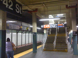
- Why is the word “Exit” on a red background? Does following the arrow mean you’re going to the exit? The red divides the routes on the right from the arrow. I was unsure whether following the arrow meant the exit, those lines, or both.
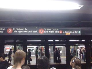
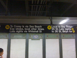
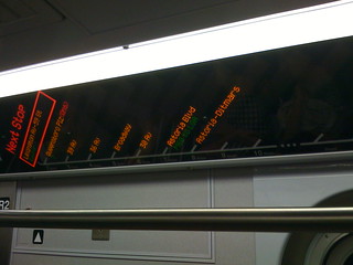
- What does this mean: “Local to Bay Ridge-95 St. Late nights N to 36 St, Bklyn for R” ?
- I actually like the alphanumeric dots of color, but why mix them into the language? At a glance it should be obvious what trains are coming to the platform your standing at.
- Once you’re underground, which way is North? South? When you’re spun around, it can be very confusing. Don’t look to the signs; unless you know the city they won’t help you. I was amazed that even the transit maps (not pictured) while telling you “you’re here” failed to point out which way you were going. Unless you traced the route to the last stop - and even that wasn’t consistent.
- Pay-to-turn bidirectional revolving steel doors? I for one find those things scary as hell. They remind me of one of those elaborate cave traps Indian Jones gets stuck in in the Temple of Doom. To make matters worse, they turn both ways on some ratcheting system. Not enjoyable.
##What I Found Comforting##
- The students playing a concerto in the walkways. Really good stuff.
- The electronic signageon some of the subways. They give a bright and clear indication of direction of travel, make it obvious which stop you’re at, and dynamically show only the pertinent information like what stops are coming, not those that have passed.
Lack of conventions, obscure abbreviations, and unclear signage made for a fairly confusing night ride. Might not seem bad reading it at your laptop, but three stories underground, with trains whizzing by and no access to the outside world makes it pretty daunting.
Compare that to Chicago, granted a much simpler subway system (I feel inadequate even linking to a picture of the subway map):
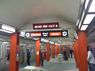
Lines have clear names, and the construction emphasizes the route (red line = red steal girders). While maybe redundant, the signs are explicit (“Board here”) bringing the commuting experience down to the lowest common denominator. Maybe that says something about a difference between East Coasters and Midwesterners.
But I think it says more about design: know your audience. A public transit system has to serve everyone from the battle hardened city warrior, to the foreign tourist. Just the dependence on full English sentences describing routes throughout the NY transit system seems like a huge design deficiency to me.
Compare their websites, too: Chicago vs New York.
But one can’t be too harsh, just take a close up look at their subway map and you’ll see it’s really incredible.